
Today I went to the Lincoln brand launch at the Visit Lincoln Partnership meeting at Bishop Grosseteste University College. Andy Clayton from Ruddocks detailed the story behind the logo and told us it had taken several staff seven months to do. For those people not of a creative bent, this might seem a very long time!
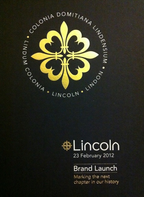
The logo is based on the Fleur de Lys, but manipulated and elongated slightly. Then four are placed so that the points face north, south, east and west. People have seen all sorts of things in the resulting diagram – not just the Fleur de Lys, but also swords to represent our violent past, hearts for love and even turbines to reflect our favourite blue chip Lincoln employer. The whole is then surrounded with the various names of Lincoln through the ages.
As for the actual word Lincoln, the team had noticed that Lincoln contains lots of arches so they kept a nice clean ageless font and replaced the two ‘n’s with arches.
It’s deceptively simple and very effective.